Zens
Zens Wireless Chargers
Re-Brand
Art Direction
Gudelines
Zens’ product range was ultra-premium, but its branding didn’t reflect the same level of sophistication. To address this, we elevated the visual identity, platform line, logo, packaging, brand guidelines and developed a series of new product renders. This upgrade propelled Zens to the next level and today their products are available in Apple stores across Europe.
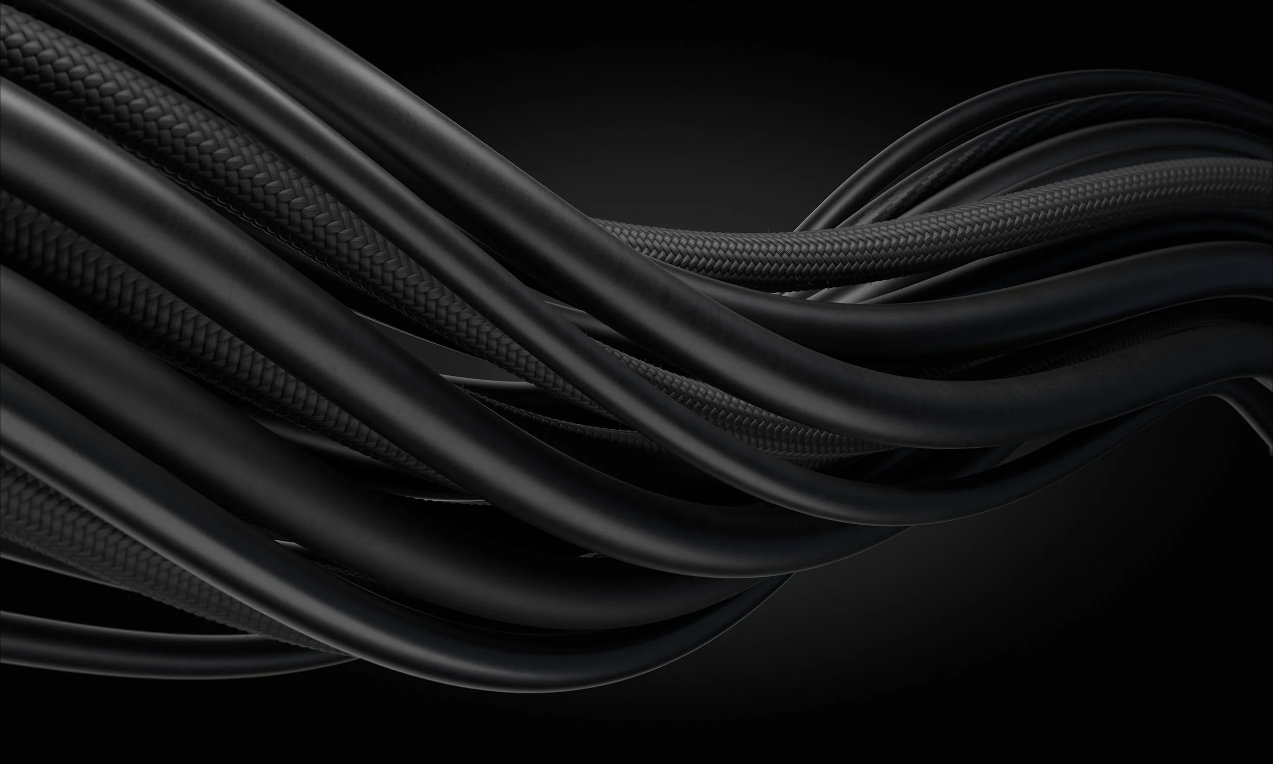
Empowering
freedom.

Inspired by the name and staying true to the products technology & minimal design.
Behind the
logo design.
Inspired by the sleek premium product aesthetics, the wordmark naturally reflects the crisp straight edges, smooth curvatures and materials. A bold graphic symbol that represents the philosophy of the Ensō symbol and Zens wireless coil technology in perfect balance.
Symmetry and balance of characters are all derived from the charging symbol, which creates a perfect balance and allows the wordmark to live on its own and be seamlessly integrated into the range of products.

Brand & product visuals.
Brand focussed key visuals use the ‘Empowering Freedom’ brand line as the main message, supported by product messaging, using depth of movement in typography and layering of product.
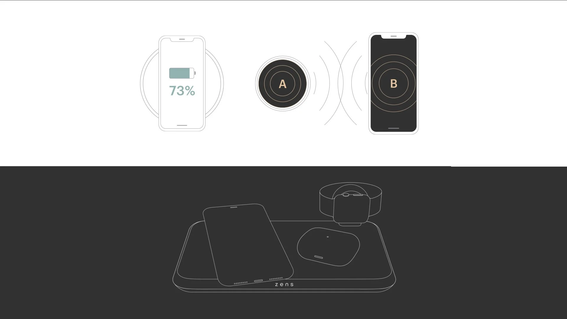
Specific product-led visuals use headlines with supporting messaging that help deliver insight and information. Using dual imagery to support and add to the story, we can visually show the ‘cluttered problem’ and the Zens solution.


Full
guidelines.
Packaging
design.
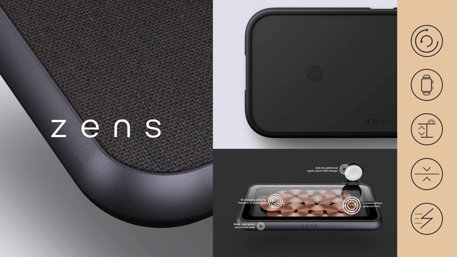
Zens packaging portfolio has been designed to work over four product series: Liberty, Modular, Aluminium & Essential. Each series has been specifically colour-coded to stay in line with the premium visual identity.
The packaging is designed to enhance the premium, tactile experience of unboxing the products. We use a copper foil on our logo and descriptor to reflect our technology, while a matte finish adds to the sensorial feel of the package.

Floating products.
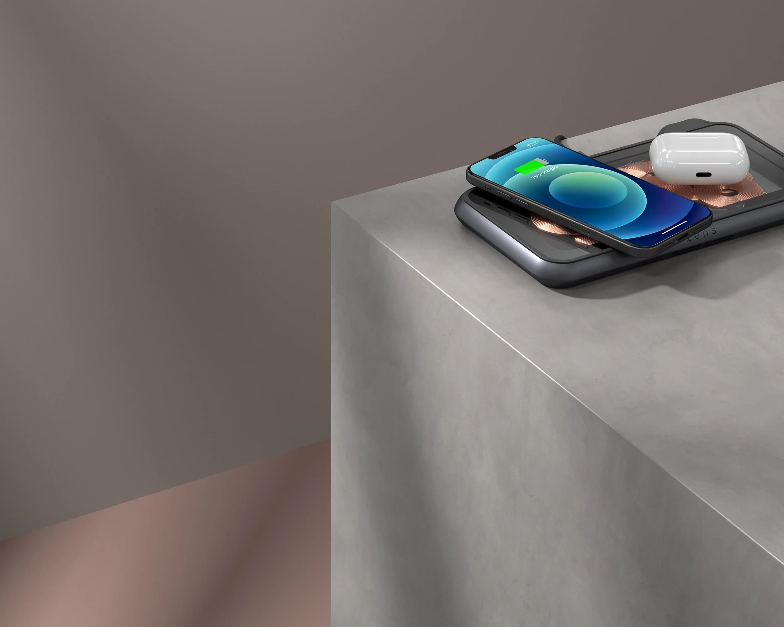
Showcasing products and devices in a free-floating state, also helps to convey simplicity, mobility and ease-of-use. Presenting them before they touch and start charging, helps to highlight the fact that there are no multiple wires needed.
-
![An image of Greenspacing.]()
Packaging range
-
![An image of Greenspacing.]()
Brand icons
-
![An image of Greenspacing.]()
Website
-
![]()
Illustrations
-
![]()
B2B illustrations
-
![]()
Lifestyle renders
-
![]()
Charging built to furniture renders


Design & art direction for the Brave New Now