
Carglass
We put people first.
Re-Brand
Design Direction
Gudelines
“People first” became the guiding principle that drove the brand’s transformation. It shifted the visual identity to feel more human, bringing photography closer to people, infused with warmth and authenticity. The brand’s tone followed suit, evolving into a more conversational, people-centered voice. This change was captured in a comprehensive Brand Book, providing clear direction and ensuring consistency across all internal touchpoints, creating a unified experience that puts people at the heart of everything.
A new brand direction to strengthen Carglass’ unique point-of-difference.


Typography with character.
Our brand typeface shares the same characteristics (sharp lines and angular edges) as the logo 'Belron® device' symbol. It gives an ownable and modern look to our brand while allowing our human tone-of-voice to be delivered in a bold, thoughtful way.

A distinct graphic window device.
Our graphic window is designed to frame all of our communications. The window is inspired by a car window, allowing us to frame a moment, a journey or service expertise. The white border allows our logo to give maximum stand out as well as soften our dominant brand colours when used as a graphic communication.
Iconography born from the logo.
The graphic iconography is designed to originate from the original master logo. Using the angles & rectangular forms as a basis of inspiration, creating a unique and ownable suite of icons to use throughout brand communications.
Animated services icons.
Full brand
guidelines.
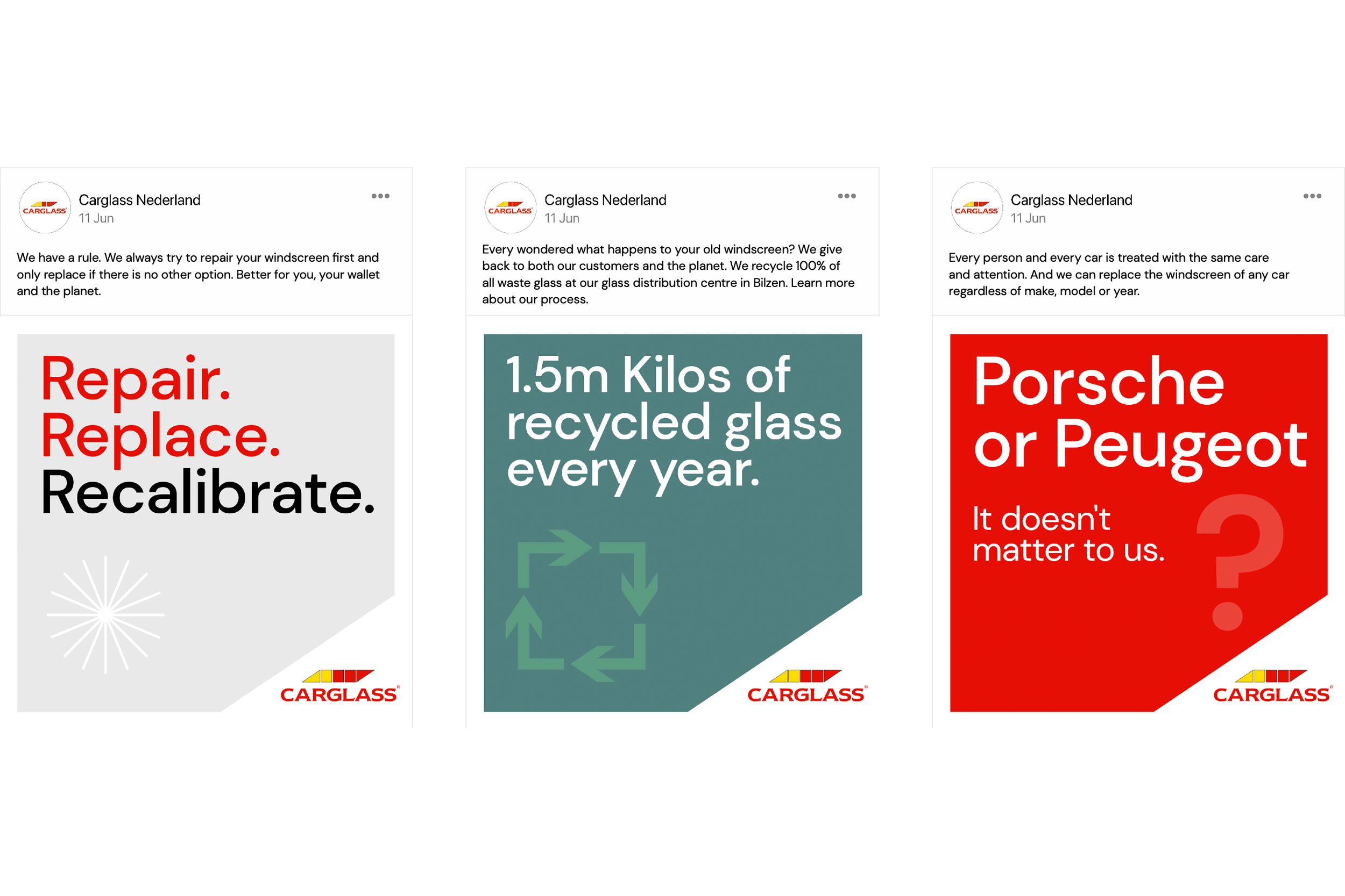
Brand communications.


Brand focused social media.
A fresh & modern website update.

A warmer, close photographic style.


Design direction for the Brave New Now