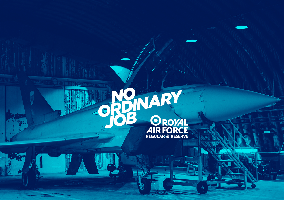
The Royal Air Force No Ordinary Job was created with a new brand identity to reflect and communicate the essence of the RAF to all of their audiences while driving recruitment.
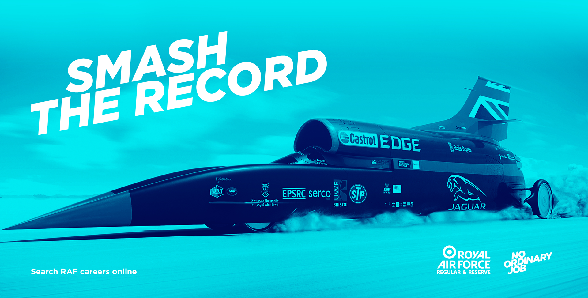
At the heart of the NO ORDINARY JOB identity is a simple idea. To create bold, distinctive and intelligent communications through a strong typographic & image led design which conveys a fast and dynamic organisation grounded in cutting edge aviation technology.

Typography is used as a visual metaphor to convey a sense of aviation and flight. This can be expressed purely through a typographic idea, or on top level communications, type can be combined with imagery and strong dynamic slices to help deliver the concept.
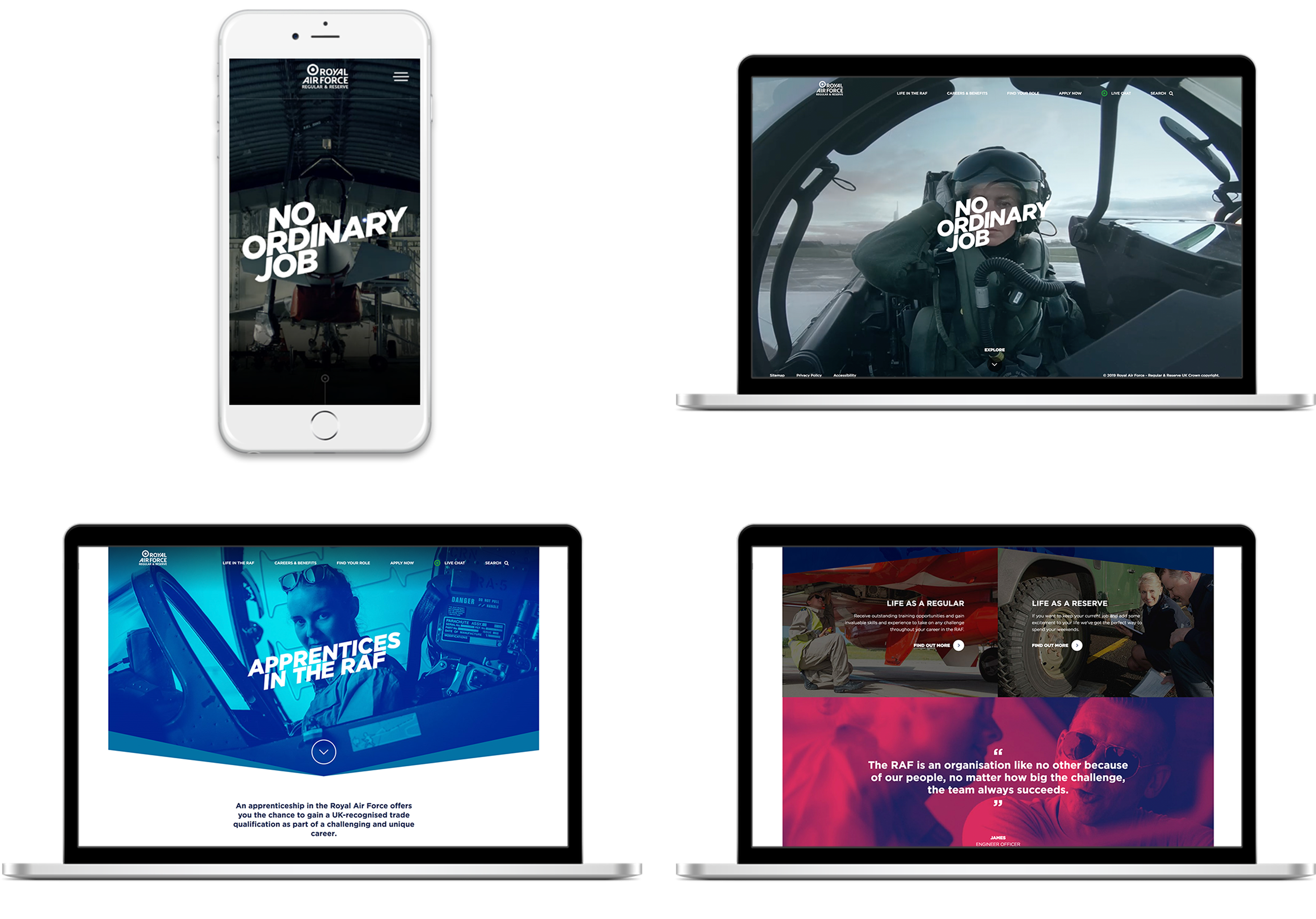
The brand look and feel were used online to help people explore potential RAF jobs and understand the wider role of the RAF. The full website can be seen HERE.

Colour is also a key tool in communicating our brand. Red, blue and white are our brand colours but our bright and energetic duo-tone palette helps bring energy to the identity and works well on and off white.
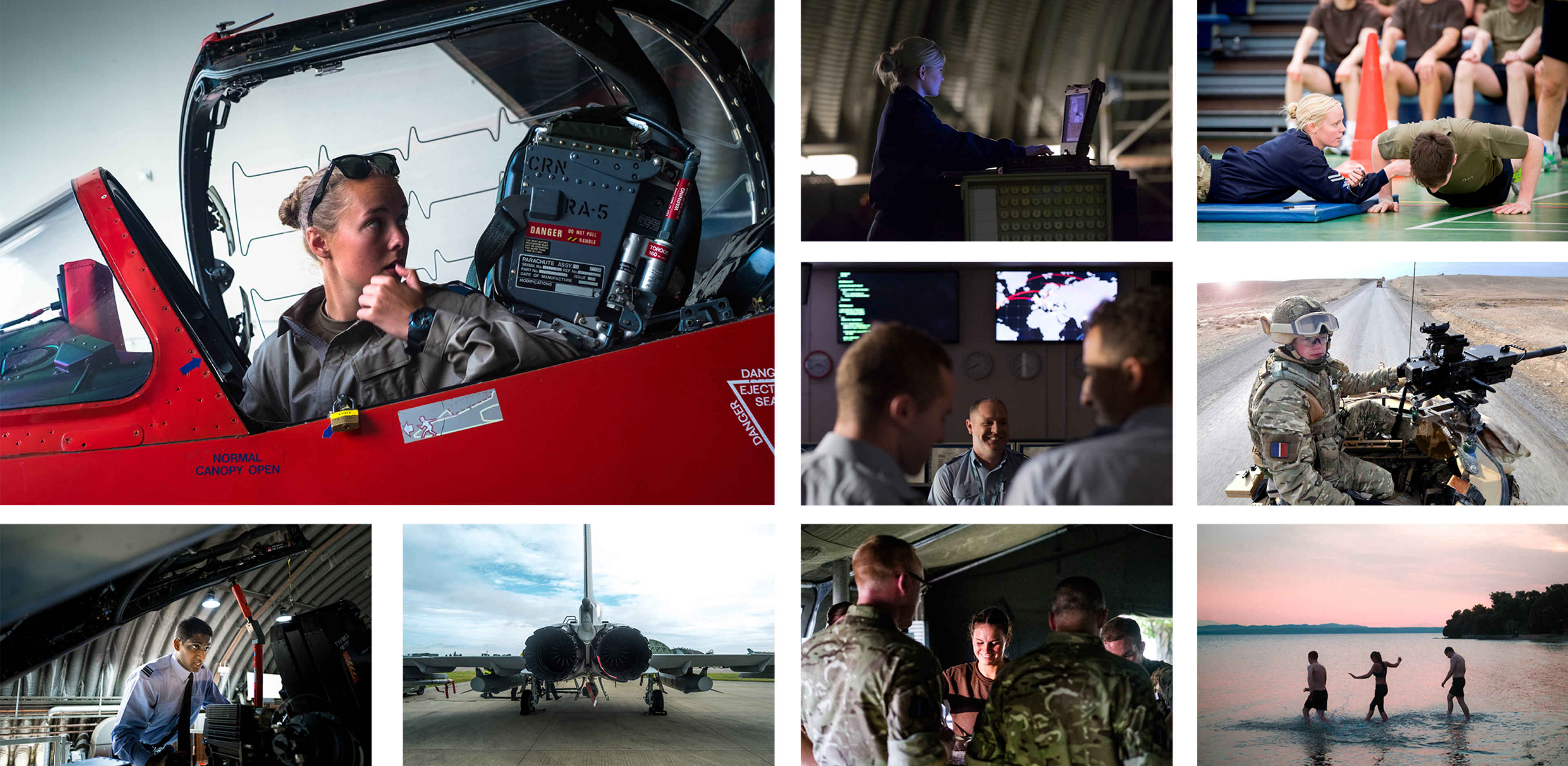
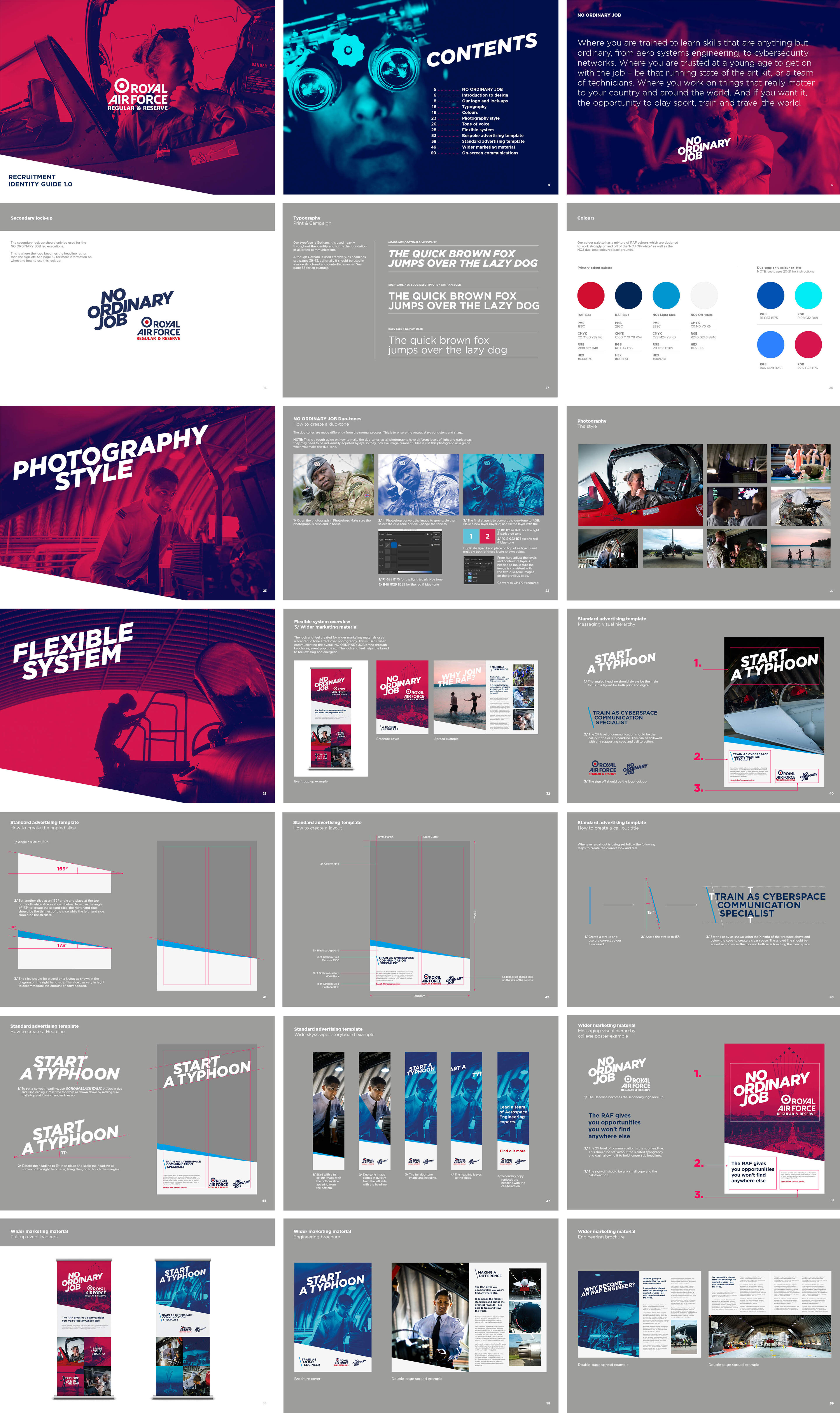
The aim of the photographic style was to capture real personality and energy in the portraits, photographing moments of people in their everyday lives.
Art Direction & Design for WCRS London